At some stage in your career, it’s likely you’ll be asked by a client to design a HTML email. Before you rush to explain that all the cool kids are using social media, keep in mind that when done correctly, email is still one of the best ways to promote you and your clients online. In fact, a recent survey showed that every dollar spent on email marketing this year generated more than $40 in return. That’s more than any other marketing channel, including the cool ones.
There are a whole host of ingredients that contribute to a good email marketing campaign. Permission, relevance, timeliness and engaging content are all important. Even so, the biggest challenge for designers still remains building an email that renders well across all the popular email clients.
Same same, but different
Before getting into the details, there are some uncomfortable facts that those new to HTML email should be aware of. Building an email is not like building for the web. While web browsers continue their onward march towards standards, many email clients have stubbornly stayed put. Some have even gone backwards. In 2007, Microsoft switched the Outlook rendering engine from Internet Explorer to Word. Yes, as in the word processor. Add to this the quirks of the major web-based email clients like Gmail and Hotmail, sprinkle in a little Lotus Notes and you’ll soon realize how different the email game is.
While it’s not without its challenges, rest assured it can be done. In my experience the key is to focus on three things. First, you should keep it simple. The more complex your email design, the more likely is it to choke on one of the popular clients with poor standards support. Second, you need to take your coding skills back a good decade. That often means nesting tables, bringing CSS inline and following the coding guidelines I’ll outline below. Finally, you need to test your designs regularly. Just because a template looks nice in Hotmail now, doesn’t mean it will next week.
Setting your lowest common denominator
To maintain your sanity, it’s a good idea to decide exactly which email clients you plan on supporting when building a HTML email. While general research is helpful, the email clients your subscribers are using can vary significantly from list to list. If you have the time there are a numberof tools that can tell you specifically which email clients your subscribers are using. Trust me, if the testing shows almost none of them are using a client like Lotus Notes, save yourself some frustration and ignore it altogether.
Knowing which email clients you’re targeting not only makes the building process easier, it can save you lots of time in the testing phase too. For the purpose of this article, I’ll be sharing techniques that give the best results across all of the popular clients, including the notorious ones like Gmail, Lotus Notes 6 and Outlook 2007. Just remember that pixel perfection in all email clients is a pipe dream.
Let’s get started.
Use tables for layout
Because clients like Gmail and Outlook 2007 have poor support for float, margin and padding, you’ll need to use tables as the framework of your email. While nested tables are widely supported, consistent treatment of width, margin and padding within table cells is not. For the best results, keep the following in mind when coding your table structure.
Set the width in each cell, not the table
When you combine table widths, td widths, td padding and CSS padding into an email, the final result is different in almost every email client. The most reliable way to set the width of your table is to set a width for each cell, not for the table itself.
<table cellspacing="0" cellpadding="10" border="0">
<tr>
 <td width="80"></td>
 <td width="280"></td>
</tr>
</table>
Never assume that if you don’t specify a cell width the email client will figure it out. It won’t. Also avoid using percentage based widths. Clients like Outlook 2007 don’t respect them, especially for nested tables. Stick to pixels. If you want to add padding to each cell, use either the cellpadding attribute of the table or CSS padding for each cell, but never combine the two.
Err toward nesting
Table nesting is far more reliable than setting left and right margins or padding for table cells. If you can achieve the same effect by table nesting, that will always give you the best result across the buggier email clients.
Use a container table for body background colors
Many email clients ignore background colors specified in your CSS or the <body> tag. To work around this, wrap your entire email with a 100% width table and give that a background color.
<table cellspacing="0" cellpadding="0" border="0" width="100%">
<tr>
 <td bgcolor=”#000000”>
 Your email code goes here.
 </td>
</tr>
</table>
You can use the same approach for background images too. Just remember that some email clients don’t support them, so always provide a fallback color.
Avoid unnecessary whitespace in table cells
Where possible, avoid whitespace between your <td> tags. Some email clients (ahem, Yahoo! and Hotmail) can add additional padding above or below the cell contents in some scenarios, breaking your design for no apparent reason.
CSS and general font formatting
While some email designers do their best to avoid CSS altogether and rely on the dreaded <font> tag, the truth is many CSS properties are well supported by most email clients. See this comprehensive list of CSS support across the major clients for a good idea of the safe properties and those that should be avoided.
Always move your CSS inline
Gmail is the culprit for this one. By stripping the CSS from the <head> and <body> of any email, we’re left with no choice but to move all CSS inline. The good news is this is something you can almost completely automate. Free services like Premailer will move all CSS inline with the click of a button. I recommend leaving this step to the end of your build process so you can utilize all the benefits of CSS.
Avoid shorthand for fonts and hex notation
A number of email clients reject CSS shorthand for the font property. For example, never set your font styles like this.
p {
 font:bold 1em/1.2em georgia,times,serif;
}
Instead, declare the properties individually like this.
p {
   font-weight: bold;
   font-size: 1em;
   line-height: 1.2em;
   font-family: georgia,times,serif;
}
While we’re on the topic of fonts, I recently tested every conceivable variation of @font-face across the major email clients. The results were dismal, so unfortunately it’s web-safe fonts in email for the foreseeable future.
When declaring the color property in your CSS, some email clients don’t support shorthand hexadecimal colors like color:#f60; instead of color:#ff6600;. Stick to the longhand approach for the best results.
Paragraphs
Just like table cell spacing, paragraph spacing can be tricky to get a consistent result across the board. I’ve seen many designers revert to using double <br /> or DIVs with inline CSS margins to work around these shortfalls, but recent testing showed that paragraph support is now reliable enough to use in most cases (there was a time when Yahoo! didn’t support the paragraph tag at all).
The best approach is to set the margin inline via CSS for every paragraph in your email, like so:
p {
 margin: 0 0 1.6em 0;
}
Again, do this via CSS in the head when building your email, then use Premailer to bring it inline for each paragraph later.
If part of your design is height-sensitive and calls for pixel perfection, I recommend avoiding paragraphs altogether and setting the text formatting inline in the table cell. You might need to use table nesting or cellpadding / CSS to get the desired result. Here’s an example:
<td width="200" style="font-weight:bold; font-size:1em; line-height:1.2em; font-family:georgia,'times',serif;">your height sensitive text</td>
Links
Some email clients will overwrite your link colors with their defaults, and you can avoid this by taking two steps. First, set a default color for each link inline like so:
<a href="http://somesite.com/" style="color:#ff00ff">this is a link</a>
Next, add a redundant span inside the a tag.
<a href="http://somesite.com/" style="color:#ff00ff"><span style="color:#ff00ff">this is a link</span></a>
To some this may be overkill, but if link color is important to your design then a superfluous span is the best way to achieve consistency.
Images in HTML emails
The most important thing to remember about images in email is that they won’t be visible by default for many subscribers. If you start your design with that assumption, it forces you to keep things simple and ensure no important content is suppressed by image blocking.
With this in mind, here are the essentials to remember when using images in HTML email:
Avoid spacer images
While the combination of spacer images and nested tables was popular on the web ten years ago, image blocking in many email clients has ruled it out as a reliable technique today. Most clients replace images with an empty placeholder in the same dimensions, others strip the image altogether. Given image blocking is on by default in most email clients, this can lead to a poor first impression for many of your subscribers. Stick to fixed cell widths to keep your formatting in place with or without images.
Always include the dimensions of your image
If you forget to set the dimensions for each image, a number of clients will invent their own sizes when images are blocked and break your layout. Also, ensure that any images are correctly sized before adding them to your email. Some email clients will ignore the dimensions specified in code and rely on the true dimensions of your image.
Avoid PNGs
Lotus Notes 6 and 7 don’t support 8-bit or 24-bit PNG images, so stick with the GIF or JPG formats for all images, even if it means some additional file size.
Provide fallback colors for background images
Outlook 2007 has no support for background images (aside from this hack to get full page background images working). If you want to use a background image in your design, always provide a background color the email client can fall back on. This solves both the image blocking and Outlook 2007 problem simultaneously.
Don’t forget alt text
Lack of standards support means email clients have long destroyed the chances of a semantic and accessible HTML email. Even still, providing alt text is important from an image blocking perspective. Even with images suppressed by default, many email clients will display the provided alt text instead. Just remember that some email clients like Outlook 2007, Hotmail and Apple Mail don’t support alt text at all when images are blocked.
Use the display hack for Hotmail
For some inexplicable reason, Windows Live Hotmail adds a few pixels of additional padding below images. A workaround is to set the display property like so.
img {display:block;}
This removes the padding in Hotmail and still gives you the predicable result in other email clients.
Don’t use floats
Both Outlook 2007 and earlier versions of Notes offer no support for the float property. Instead, use the align attribute of the img tag to float images in your email.
<img src="image.jpg" align="right">
If you’re seeing strange image behavior in Yahoo! Mail, adding align=“top” to your images can often solve this problem.
Video in email
With no support for JavaScript or the object tag, video in email (if you can call it that) has long been limited to animated gifs. However, some recent research I did into the HTML5 video tag in email showed some promising results.
Turns out HTML5 video does work in many email clients right now, including Apple Mail, Entourage 2008, MobileMe and the iPhone. The real benefit of this approach is that if the video isn’t supported, you can provide reliable fallback content such as an animated GIF or a clickable image linking to the video in the browser.
Of course, the question of whether you should add video to email is another issue altogether. If you lean toward the “yes” side check out the technique with code samples.
What about mobile email?
The mobile email landscape was a huge mess until recently. With the advent of the iPhone, Android and big improvements from Palm and RIM, it’s becoming less important to think of mobile as a different email platform altogether.
That said, there are a few key pointers to keep in mind when coding your emails to get a decent result for your more mobile subscribers.
Keep the width less than 600 pixels
Because of email client preview panes, this rule was important long before mobile email clients came of age. In truth, the iPhone and Pre have a viewport of 320 pixels, the Droid 480 pixels and the Blackberry models hover around 360 pixels. Sticking to a maximum of 600 pixels wide ensures your design should still be readable when scaled down for each device. This width also gives good results in desktop and web-based preview panes.
Be aware of automatic text resizing
In what is almost always a good feature, email clients using webkit (such as the iPhone, Pre and Android) can automatically adjust font sizes to increase readability. If testing shows this feature is doing more harm than good to your design, you can always disable it with the following CSS rule:
-webkit-text-size-adjust: none;
Don’t forget to test
While standards support in email clients hasn’t made much progress in the last few years, there has been continual change (for better or worse) in some email clients. Web-based providers like Yahoo!, Hotmail and Gmail are notorious for this. On countless occasions I’ve seen a proven design suddenly stop working without explanation.
For this reason alone it’s important to retest your email designs on a regular basis. I find a quick test every month or so does the trick, especially in the web-based clients. The good news is that after designing and testing a few HTML email campaigns, you will find that order will emerge from the chaos. Many of these pitfalls will become quite predictable and your inbox-friendly designs will take shape with them in mind.
Looking ahead
Designing HTML email can be a tough pill for new designers and standardistas to swallow, especially given the fickle and retrospective nature of email clients today. With HTML5 just around the corner we are entering a new, uncertain phase. Will email client developers take the opportunity to repent on past mistakes and bring email clients into the present? The aim of groups such as the Email Standards Project is to make much of the above advice as redundant as the long-forgotten <blink> and <marquee> tags, however, only time will tell if this is to become a reality.
Although not the most compliant (or fashionable) medium, the results speak for themselves – email is, and will continue to be one of the most successful and targeted marketing channels available to you. As a designer with HTML email design skills in your arsenal, you have the opportunity to not only broaden your service offering, but gain a unique appreciation of how vital standards are.


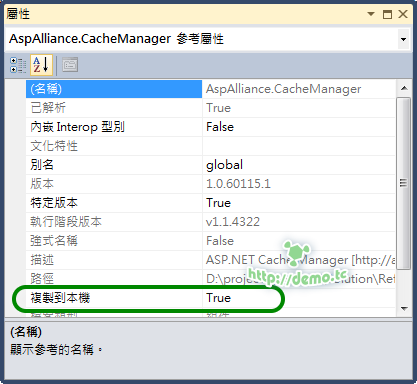
 本文的重點是 Web.Release.config 因為 Web.Debug.config 通常就是預設的 Web.config 而且設定方法都一樣所以不介紹它,點開 Web.Release.config 後會看到以下詳盡的註解
 以上的註解其實還滿容易了解的,拿一個簡單範例來說
 如果你是使用 ASP.NET MVC 你可能會發現在使用 Release 編譯並且有開編譯 View 時很容易發生